

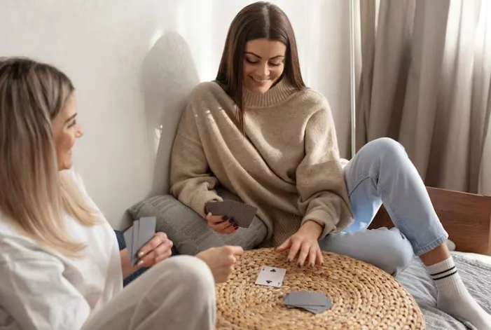
You walk into a new apartment and the walls are that same soft, sandy neutral you’ve seen in a hundred other rental listings, and something in you exhales without quite knowing why. The color beige gets a bad reputation as the color of boredom, of playing it safe, of having no opinion at all. But your nervous system doesn’t read it that way. It reads warmth, quiet, and an absence of demand. That’s not nothing. That’s actually a fairly sophisticated psychological response happening in a fraction of a second.
This tension between beige’s cultural reputation and its actual psychological effect is worth untangling, because most people have absorbed the “boring” label without ever questioning where it came from or whether it’s even accurate. Beige surrounds us constantly, in waiting rooms, rental walls, linen fabric, and unbleached wool, precisely because it does something genuinely useful: it lowers visual and emotional stimulation without feeling cold or sterile the way stark white sometimes can. Understanding why a color this unassuming carries such consistent psychological weight reveals something real about how the human brain processes color more broadly.
So what is actually happening in the human mind when it encounters this quiet, understated hue?
This guide explores the meaning of the color beige in psychology, covering its emotional associations, cultural history, and practical applications in design, branding, and everyday environments.
What Does the Color Beige Represent in Psychology?
Beige represents neutrality, stability, and emotional calm, sitting at the visual midpoint between white and light brown. Psychologically, it functions as a kind of visual rest stop. Low-stimulation colors like beige don’t demand attention the way saturated hues do, which is precisely their appeal.
Color researcher Faber Birren, whose extensive twentieth-century work connected specific hues to measurable emotional and physiological responses, argued that muted, desaturated tones like beige tend to produce a calming, non-arousing effect on the nervous system, in contrast to high-chroma colors that trigger alertness or excitement. That distinction matters. Beige isn’t simply “less interesting” than red or yellow; it’s doing something functionally different, prioritizing calm over stimulation.
The word itself traces back to the French term for natural, undyed wool, and that etymology isn’t incidental at all. Beige’s psychological association with authenticity and simplicity stems directly from its origin as the color of raw, unprocessed material, something honest and unembellished rather than artificially enhanced or synthetically produced.
| Positive Associations | Potential Negative Associations |
| Calm and Security: Stability, comfort, and a non-threatening visual presence. | Boredom and Apathy: Lack of energy or excitement when overused without contrast. |
The Psychological Effects of Neutral, Low-Stimulation Colors
Neutral colors work by reducing the visual “noise” the brain has to process, freeing up cognitive resources for other tasks. This is why beige shows up so often in spaces meant for concentration or rest rather than excitement.
Because beige lacks strong chromatic saturation, it doesn’t trigger the same arousal response that bright, high-contrast colors do. Psychologist Angela Wright, developer of the Colour Affects System used widely in commercial design, has argued that muted, low-saturation tones support a settled emotional state precisely because the eye and brain don’t have to work hard interpreting them. That settled state isn’t the same as dullness, though it can tip into that territory in the wrong context.
Environments requiring sustained attention, such as offices, therapy rooms, or spas, frequently lean on beige and similar neutrals for exactly this reason. Reduced visual demand translates into measurably lower reported stress in some environmental psychology studies, even though the color itself is doing something subtle rather than dramatic. It’s easy to underestimate a color that works simply by quietly getting out of the way and letting attention go elsewhere.
Why Beige Is Associated with Calm, Stability, and Security
Beige’s calming reputation isn’t just marketing language; it connects to genuine psychological associations the human mind has built between this color and safety. Sand, stone, and natural fiber all appear in beige tones, and all three carry deep associations with solid ground and shelter.
German researcher Eva Heller, whose extensive survey-based research on color associations across thousands of participants remains a foundational reference in color psychology, found that beige and similar earth tones consistently ranked among the colors associated with reliability and quiet comfort rather than excitement or passion. That’s not a coincidence. Earth-toned neutrals tap into something ancient: the visual palette of shelter, food, and safe terrain long before anyone had synthetic dyes or pigments to work with at all.
This is part of why beige gets chosen so frequently for spaces meant to soothe: waiting rooms, bedrooms, therapy offices, all relying on this soothing neutral. The color isn’t trying to impress you. It’s trying to let your nervous system settle, which, depending on the context, is either exactly what’s needed or a little too passive for the moment at hand.

The Cultural and Historical Origins of Beige’s Meaning
Beige carries different cultural weight depending on era and region, though its association with simplicity and restraint shows up consistently across most Western contexts. Understanding this history helps explain why the color reads as both timeless and, at times, a little dated.
In mid-twentieth-century design, beige became closely associated with corporate conformity, largely because early computers, office furniture, and institutional interiors adopted it en masse as a “safe,” inoffensive default. That association stuck for decades, giving beige an unfair reputation as the color of blandness rather than intentional calm. More recently, design movements centered on “quiet luxury” and natural materials have rehabilitated beige considerably, reframing it as sophisticated restraint rather than a lack of imagination.
Art theorist Johannes Itten, whose foundational color theory work shaped generations of design education, emphasized that neutral tones function as essential visual “rest notes” within a broader composition, allowing more saturated colors to stand out by genuine contrast. Beige, in this framework, isn’t a failure to commit to a bolder choice. It’s a deliberate structural element that makes everything else in a space or design considerably more legible and balanced.
Does a Preference for Beige Reveal Anything About Personality?
Color preference research suggests some connection between neutral color choices and personality traits, though the link is modest rather than deterministic. People who consistently gravitate toward beige often report valuing consistency and calm over novelty and high stimulation, but that correlation doesn’t mean every beige-lover shares identical traits.
Survey-based color psychology research, including large-scale studies conducted by Eva Heller across thousands of participants, found that neutral color preferences correlated moderately with self-reported traits like conscientiousness and emotional stability, though cultural background and personal history shaped these patterns considerably. It would be a stretch to claim beige preference predicts personality with any precision. It’s more accurate to say the color tends to appeal to people already inclined toward steadiness, rather than beige itself creating that trait.
It’s also worth noting that practical considerations frequently override deep psychological signaling. Someone might choose beige for a rental apartment purely because landlords favor it, or select a beige coat because it matches everything in their closet, a purely functional decision rather than an expression of inner temperament. Reading too much into a single color choice, without considering context, risks the same oversimplification that makes casual color-personality quizzes more entertaining than scientifically rigorous.
Beige in Interior Design and Its Impact on Mood
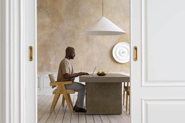
Interior spaces painted or furnished in beige tend to produce a calmer, less visually demanding atmosphere than rooms filled with bold or highly saturated colors, supporting overall environmental psychology goals. That effect shows up differently depending on which room of the house you’re considering.
In bedrooms, beige’s association with tranquility supports the wind-down process before sleep, avoiding the visual stimulation that brighter colors can introduce right when your nervous system is trying to slow down. In home offices, the same neutral quality supports sustained focus without the fatigue that can accompany busier, more colorful surroundings. Living rooms benefit from beige’s warmth-without-intensity quality, creating a shared space that feels inviting without imposing a strong mood on everyone who enters it.
Color and design consultant Leatrice Eiseman, whose extensive work at the Pantone Color Institute has shaped how designers think about color’s psychological function, has noted that neutral palettes like beige often serve as a foundation precisely because they don’t compete with the textures, art, or personal objects layered on top of them. That flexibility is a genuine design advantage, not a lack of personality.
- Bedrooms painted in beige tones support relaxation and sleep readiness by minimizing visual stimulation before rest.
- Home offices benefit from beige’s low-arousal quality, supporting sustained concentration during demanding tasks.
- Living spaces gain flexibility from beige’s neutral base, allowing personal decor choices, artwork, and cherished objects to stand out clearly against it.
Beige in Branding, Fashion, and Personal Style Psychology
Brands and individuals choosing beige are frequently signaling something specific: reliability, understatement, and a preference for substance over flash, reflecting deliberate brand positioning. This isn’t a random aesthetic choice; it reflects genuine psychological intent.
In branding, beige and similar neutral palettes often appear in industries built on trust and quality craftsmanship rather than novelty or excitement, including certain luxury goods, wellness brands, and financial services. The color communicates competence without shouting about it, which suits contexts where credibility matters more than immediate visual excitement. Fashion follows a similar logic: beige clothing frequently signals quiet confidence and timeless taste rather than trend-chasing, appealing to people who’d rather their choices age well than make a loud first impression.
Carl Jung’s broader theories on symbolism, though not focused specifically on color, offer a useful lens here: neutral, earth-toned choices often reflect a psychological preference for groundedness and integration over dramatic self-expression. Choosing beige repeatedly, whether in a wardrobe or a brand identity, often reflects genuine values around consistency and restraint rather than an absence of personal taste or creative vision.

Beige Across Cultures: Does Its Meaning Stay the Same?
Beige’s association with calm and neutrality holds fairly consistently across many cultures, though specific connotations shift depending on regional history and material traditions. Understanding these variations prevents overgeneralizing from a single cultural perspective.
In many Western design traditions, beige connects strongly to minimalism, natural materials, and understated luxury, particularly in contemporary interior trends favoring linen, raw wood, and unbleached textiles. In cultures with strong traditions of vibrant, saturated color use in clothing and architecture, beige can sometimes read as comparatively muted or even foreign, lacking the celebratory quality that brighter palettes carry in those specific contexts. Neither interpretation is more correct than the other; they simply reflect different visual traditions and different relationships to color intensity as a marker of status, celebration, or restraint.
Color researcher Faber Birren noted in his cross-cultural observations that while specific color symbolism varies considerably worldwide, low-saturation, low-arousal colors like beige tend to produce broadly similar physiological calming effects regardless of cultural background, suggesting a biological component alongside the purely learned cultural one. That combination, biology plus culture working together, is what makes color psychology genuinely complex rather than a simple universal code anyone could memorize.
The Potential Downsides: Boredom, Apathy, and Invisibility
Beige’s calming quality has a genuine downside when overused: without contrast or texture, it can tip from soothing into flat monotony. The very qualities that make it restful can, in excess, read as an absence of energy altogether.
Environments saturated entirely in beige, with no textural variation, contrasting accents, or natural light to animate the space, frequently get described as sterile or uninspiring rather than calming. The line between restful and lifeless is thinner than people expect, and it depends heavily on complementary elements like lighting, texture, and a few contrasting accent colors doing the work beige alone can’t do.
There’s also a psychological risk worth naming honestly: excessive beige in personal style or environment can sometimes reflect avoidance behavior rather than genuine preference, a way of staying invisible or unremarkable rather than a deliberate aesthetic choice. That’s not universally true. Plenty of people genuinely love beige for its own sake, finding real comfort in its quiet consistency. But if beige shows up everywhere in someone’s life specifically to avoid being noticed, that pattern might be worth examining alongside broader questions about self-expression and visibility.
How Beige Compares to Other Neutral Colors
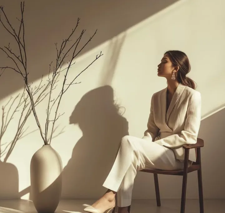
Beige occupies a specific niche among neutral colors, offering warmth that stark white and cool gray typically lack. Comparing it directly to its closest relatives clarifies why designers and individuals choose one neutral over another for specific psychological effects.
White carries associations with cleanliness and clinical precision, sometimes reading as cold or sterile in residential contexts where beige feels warmer and more forgiving. Gray tends toward a more modern, sometimes emotionally flat association, useful for minimalist aesthetics but lacking beige’s connection to natural, organic materials. Beige’s warmth comes specifically from its underlying yellow or red undertones, distinguishing it meaningfully from the cooler undertones typical of most grays.
Taupe, a close cousin that blends beige with gray, splits the difference, offering some of beige’s warmth with a slightly more sophisticated, muted quality. Choosing between these neutrals often comes down to the specific emotional tone a space or design is trying to achieve overall. None of these neutrals is objectively superior. Each does slightly different psychological work depending on undertone, lighting, and surrounding context in the room.
How to Use Beige Intentionally in Your Environment
Using beige well requires treating it as an active design decision rather than a default fallback. The color rewards intentional pairing far more than it rewards simply avoiding a decision about what else to use.
Layering texture is the single most effective way to keep a beige-dominant space from feeling flat: woven fabrics, natural wood grain, and varied material finishes all add visual interest without introducing competing color. Pairing beige with one or two deliberate accent colors, whether a deep terracotta, a muted sage green, or a rich navy, gives the eye somewhere to land while beige continues doing its calming, grounding work in the background. Natural light also dramatically affects how beige reads in a space, often appearing warmer and richer under sunlight and flatter under harsh artificial lighting.
- Add varied textures like linen, wood, and woven materials to prevent a beige-dominant space from feeling flat or sterile.
- Introduce one or two accent colors deliberately, giving the eye a focal point while beige anchors the overall palette.
- Maximize natural light exposure in beige-heavy rooms, since lighting significantly changes how warm or cool the color reads.
Approached this way, beige stops being a placeholder and becomes a genuine, considered choice reflecting real design intent. Intentional use transforms the color from “safe default” into something that actually supports the specific mood a space is trying to create for the people living inside it.
FAQs about the Meaning of the Color Beige in Psychology
Why is beige considered a calming color in psychology?
Beige is considered calming because it has low chromatic saturation, meaning it doesn’t trigger the same visual arousal response that bright, highly saturated colors produce. This reduced stimulation allows the nervous system to settle rather than stay alert, which is why beige appears frequently in spaces designed for rest, focus, or relaxation, such as bedrooms, spas, and therapy offices. Its association with natural materials like sand, wool, and stone also connects it psychologically to safety and shelter, reinforcing the sense of calm beyond just its visual properties alone.
Does beige have negative psychological associations too?
Yes, beige can carry negative associations when used excessively or without contrast, including feelings of boredom, apathy, or a lack of energy. Because the color doesn’t demand attention, an entirely beige environment with no textural variation or accent colors can start to feel flat or uninspiring rather than calming. In personal style, an exclusive preference for beige can sometimes reflect a desire to avoid standing out rather than a genuine aesthetic preference, though this isn’t true for everyone who simply enjoys the color on its own merits.
What’s the difference between beige, tan, and taupe in color psychology?
Beige, tan, and taupe are all neutral colors but carry slightly different undertones and psychological associations. Beige tends toward a lighter, warmer, more yellow-based neutral associated with softness and comfort. Tan is generally a bit darker and more saturated, carrying stronger associations with natural leather, earth, and durability. Taupe blends beige with gray, producing a more muted, sophisticated neutral often associated with modern elegance rather than the cozier warmth of pure beige. The differences are subtle but meaningful in design contexts where the specific emotional tone matters.
Why do offices and waiting rooms use so much beige?
Offices and waiting rooms frequently use beige because it minimizes visual distraction while still feeling warm and approachable compared to stark white or clinical gray. This supports both sustained concentration in work environments and a sense of calm in spaces where people may already be feeling anxious, such as medical waiting rooms. Beige also tends to be a safe, broadly inoffensive choice that doesn’t provoke strong reactions in either direction, making it a practical default for shared spaces used by people with widely varying color preferences.
Is beige a good color choice for a bedroom?
Beige is generally considered a strong choice for bedrooms specifically because of its calming, low-stimulation qualities, which support the wind-down process before sleep. Unlike brighter or more saturated colors that can feel visually activating, beige creates a quiet backdrop that doesn’t compete with the goal of rest and relaxation. To avoid the space feeling flat, it helps to pair beige walls or bedding with varied textures, like woven throws or natural wood furniture, and perhaps one or two accent colors in artwork or decor to add visual interest without disrupting the room’s calming foundation.
Can the color someone wears or decorates with reveal something about their personality?
Color preferences can offer some insight into personality tendencies, though this connection is generally more nuanced and less definitive than popular color-personality quizzes suggest. A consistent preference for beige and other neutrals often correlates with values like reliability, calm, and understated confidence, but it can also simply reflect practical considerations like versatility or personal taste unrelated to deeper psychological traits. Psychologists generally caution against drawing firm conclusions about someone’s character purely from color preference, since context, culture, and individual history all shape these choices considerably.
Is there scientific research behind color psychology, or is it mostly speculation?
There’s a meaningful body of legitimate research on color psychology, though the field also contains plenty of oversimplified claims that outpace the actual evidence. Studies on color and physiological arousal, mood, and even purchasing behavior show measurable effects for certain colors under controlled conditions, particularly regarding saturation and brightness rather than specific hues. However, many popular claims about exact colors producing exact emotions in all people universally overstate what the research actually supports, since individual differences, cultural background, and context all meaningfully shape how any given color gets experienced by different people.
Why do some people find beige boring while others find it soothing?
Individual differences in sensory processing, personal associations, and even cultural background all influence how someone experiences a color like beige. Someone who associates beige with corporate blandness from childhood or a previous unpleasant environment may respond to it quite differently than someone who associates it with cozy natural materials and calm home environments. Personality also plays a role, since people who generally seek higher stimulation and novelty may find beige understimulating compared to someone who finds excessive visual stimulation genuinely uncomfortable or overwhelming. Both reactions are valid responses shaped by different nervous systems and entirely different personal histories with this particular, quietly polarizing color.
What undertones should I look for when choosing a beige for my home?
Beige comes in warm, cool, and rosy undertones, and choosing the right one depends on the mood you want a space to convey along with the lighting conditions in the room. Warm beiges, leaning slightly yellow or orange, tend to feel cozy and grounded, pairing well with wood tones and brass fixtures. Cool beiges, with a subtle gray undertone, feel more minimal and composed, working nicely alongside marble, steel, or soft blue accents. It helps to test paint swatches directly in the room at different times of day, since natural and artificial lighting can shift how a particular beige undertone actually reads once it’s applied to the wall and furnishings around it.
Bibliography
- Birren, F. (1950). Color Psychology and Color Therapy: A Factual Study of the Influence of Color on Human Life. McGraw-Hill.
- Heller, E. (2009). Psychologie de la couleur: Effets et symboliques. Pyramyd.
- Itten, J. (1961). The Art of Color: The Subjective Experience and Objective Rationale of Color. Van Nostrand Reinhold.
- Wright, A. Colour Affects: The Psychological Properties of Colours. Colour Affects Ltd.
- Eiseman, L. (2017). The Complete Color Harmony: Expert Color Information for Professional Color Results. Rockport Publishers.
- Jung, C. G. (1964). Man and His Symbols. Doubleday.
- St. Clair, K. (2016). The Secret Lives of Color. John Murray Publishers.
Use this citation format to reference the article clearly and help readers find the original source.
PsychologyFor. (2026). Meaning of the Color Beige in Psychology. PsychologyFor. https://psychologyfor.com/meaning-of-the-color-beige-in-psychology/