Probably most of us have had to write some type of work, evaluable activity, report, letter or document on a computer at some point. And most likely we have also had to choose from a large number of fonts the most suitable typeface depending on the situation or even the aesthetic preference: Arial, Times New Roman, Calibri, Cambria…
And throughout history and since the invention of writing and the first spellings generated to represent our ideas, there have emerged a large number of types of letters or fonts, even within the same language. There are so many options that various attempts at classification have been made, of which in this article we are going to see two specific examples.
Types of letters: elements to take into account
When making a classification of letter types, it is important to keep in mind that there are many factors that their authors can look at: the line, the thinness of the lines, the presence or absence of finishes, the shape (more rounded or more square), the direction of its axis, the maintenance or variability in thickness.
Likewise, it must also be taken into account that writing, like oral language, also evolves and changes over time, generating new types of writing and uses for it. In general, it must also be considered that different types of letters may be more or less appropriate in different contexts, although this would refer more to their use than to the type of writing itself.
Below we will see two of the most common classifications, although There are a multitude of ways to classify them We will focus on the Latin alphabet.
1. Thibaudeau classification
It is considered that the pioneer in trying to make a classification of types or fonts with a unified criterion was Francis Thibaudeau, who classified typefaces into two clearly groups. depending on whether or not it has serifs or serifs Later I would include a third group as a catch-all for those that could not be considered within the previous two.
1.1. Serifed
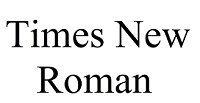
We understand serifs to be all fonts and typefaces that have small ornamental finishes, generally at their ends. This is a typeface that generally offers a more elegant appearance than in the absence of serifs (or serifs), giving a more professional appearance. One of the most used examples of this type of font is Times New Roman
Likewise, it is possible to subdivide the serifs into three groups: ancient Roman (little difference between thick and thin strokes, concave and triangular serifs), modern Roman (perceptible differences between thick and thin strokes but more stylized than the previous ones) and Egyptian (with a machine, with strokes of the same thickness and rectangular serifs).
1.2. Sin serif
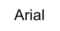
This group is characterized by not having a serif, its characters being rounded and without any type of ornamentation at their ends. Is about a simple and easy to read font, with a cleaner and more informal appearance than those with serif. Also called dry stick. One of the best-known examples of this typeface is the one that appears in the Arial font.
1.3. Others
This group mainly includes handwritten and decorative letters, which either do not have a always stable and maintained pattern or Their main function is not so much to express at a written level but rather at an image level
2. Classification of Vox-ATypI
One of the best-known classifications is the one proposed by Maximilien Vox, typographer, historian, journalist and graphic illustrator. This man advocated the development of a classification in different typologies of letters, creating the Vox typographic classification in France during 1954. It was based on the classification made by Thibaudeau
In fact, this classification system is one of the most widely used in all areas and is accepted as a standard by the International Typography Association. Over time it has received reviews, the last being the one carried out by the aforementioned association: the Vox-ATypI. In this latest revision, the letter types are classified into the following groups.
2.1. Human
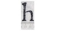
They receive the name human, humanistic or Venetian to a type of letter similar to that of the manuscripts of the 15th century, in Renaissance Venice They have small finishes, with little difference and contrast between strokes (there is no big difference between a broad stroke and a thin stroke) and with a wide separation between letters. Some fonts that use these typefaces are Centaur and Jenson.
2.2. Garaldas

Garaldas, also called aldinas, are a type of font characterized by a more marked contrast between thin and thick strokes, although their proportions are not finer and more stylized. They are named after Claude Garamond and Aldo Manucio, typographers of the 16th century. Another name given to this type of letters is Antiguas. Examples of this are the Garaldus and Palatino fountains
23. Royals

Initially born within the Royal Printing Office, the typefaces known as royal or transitional are characterized by being practically completely vertical (the previous ones, the axis of part of the letters is more oblique) and having a difference between thick and thin strokes. more marked than in the previous ones. It brings together characteristics of both classic and modern fonts, although he identifies with the first group. The well-known Times New Roman is part of this group, as well as many others such as Baskerville or Century Schoolbook.
2.4. Didonas

The didonas owe their name to the French typographer Didot, although their style was later perfected by Bodoni. They appeared around the eighteenth century to differentiate themselves from the typefaces of the old regimes, at the time of the French Revolution. In this font the difference between strokes is very marked and there is little separation between each letter. Century and Madison are examples of this type of letters, also called Modern Roman.
2.5. Mechanical

Also called Egyptian, they are typical of the Industrial Revolution and slightly emulate the technological aspect of the time. They have a lack of difference between thin and thick strokes (all strokes look practically the same thick) and rectangular serifs of the same stroke size as the rest of the letter, something that projects a certain image of strength Rockwell, Memphis or Clarendon are examples.
2.6. Linear

The linear group includes a large group of letter types without serifs or serifs. They are cleaner and more informal, and were introduced for commercial and advertising use. Within them we can find four large groups:
2.7. Incised

This style tends to seek to imitate the letters used in engravings on different materials, with uppercase letters being especially important (in fact, lowercase letters do not exist in some types). They seem carved, with a similar great amplitude in all their letters or with small and compact sarifas. An example of this is the letter Trajan or Perpetua.
2.8. Written

Imitation of the letter that arises when using writing instruments such as a pen or brush when writing. They are usually in italics and there may even be no separation between letters when they are joined. One such font is the Hyperion.
2.9. Manuals
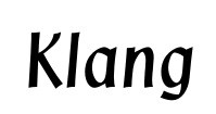
Similar to the previous ones, but done with more separation and in an apparently more calligraphic way. More advertising and used to highlight and make what is written more visual The Klang or Cartoon font type are some of the types that are included in this group.
2.10. Fractured

Group that brings together Gothic type letters, they are very ornamental and usually have pointed shapes. Fraktur is an example. In the original Vox classification they are included in the previous ones, but the International Typography Association decided to separate them.
2.11. Foreigners

This last group would include all types of spelling not corresponding to the Latin alphabet Thus alphabets such as Greek, Arabic, Chinese or Hebrew would fall into this classification.


