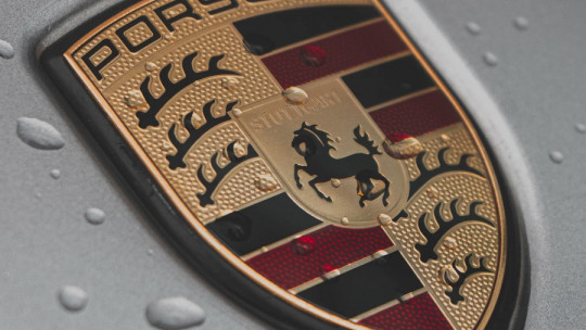
Brand logos and the way their services and products are advertised are not designed without following a pattern at all. Its visual presentation, in addition to being artistic, has an intention: to attract attention and convince the user that they need it.
Design psychology is a field closely related to marketing and that is behind the success that a company may have when promoting its products. It is the art of, through shapes, colors and style, evoking feelings in the audience to whom it is directed so that they consider consuming a good or service.
Next we are going to delve into this not so well-known branch of psychology and how it is behind some subtle but very important changes that certain companies have had in recent years.
What is design psychology?
The name design psychology does not have much mystery, since it says what it is: psychology applied to the field of design. But, What relationship can there be between psychology and the design of brands and objects? Really a lot, and in fact you could say that the psychology of design has been enormously involved when it comes to making decisions as important as choosing what the cover letter of a brand will be, that is, its own logo.
The psychology of design is based on a reality that is unquestionable: All the objects with which we interact, even through visual means, evoke sensations and perceptions in us Colors, shapes, font typography, the size of the object and symmetry are aspects that greatly influence how we feel, something that is nothing new and that the world of fine arts is very clear about.
Transferring the power of visual beauty to the world of commercial and marketing, Merchants and companies find a powerful ally in the psychology of design Knowing how they should make a logo, design an object or promote one of their services in their advertising, they can exploit the audience’s sentimentality to convince them that they have a need. Good design can generate feelings, and those feelings are what make someone feel the need to buy something that, objectively, they did not need.
Application of this branch
Although design psychology does not have to be applied exclusively to the field of marketing, it is clear that it intervenes in this field in a very significant way. It could be said that this branch is behind actions such as multimedia creation, illustration, graphic interface design, infographics, the production of brand art and its identity, among many others. We not only talk about the design of the product, but also how it is promoted Everything influences the potential buyer’s decision-making, and therefore what is presented to them should encourage them to ultimately decide to buy.
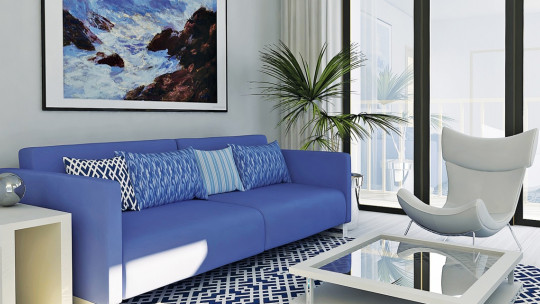
Other fields in which we could find design psychology are, for example, architecture The design of the house can influence how cold or warm it may be perceived by its visitors, something that must be considered depending on the climate of the place and the functionality of such a building. Building a museum is not the same as building a block of flats, since the former must have a design that attracts attention to be visited, innovative but solemn, while the houses must evoke homely warmth and security.
The list of examples in which the psychology of design is taken into account is very long, ranging from the design of books, squares, cars, airports and practically everything we can think of that has functionality for the public. What we can comment on more clearly are some of the phenomena that this branch takes into account, many of them typical of Gestalt theory since, like that branch, design psychology follows the idea that the whole is more than the sum of the parts
1. Proximity
Objects placed close to each other are seen as a group.
2. Similarity
Objects that look alike are perceived as one object or that are part of the same category.
3. Closure
A figure that is perceived as a whole even when the object is not completely closed.
4. Continuity
When you move from one object to another naturally.
5. Figure background
The figure is separated from the surrounding background.
6. Colors
Both naturally and culturally acquired, colors are linked to a specific register of emotions In a Western context, the color yellow or gold is related to prestige, wealth and happiness, red with danger or impulsiveness, white with purity, blue and green with health and nature. The list is as extensive as you want to make it.
When less is more
We have already mentioned on a couple of occasions that design psychology is very involved in the design of brand logos and now we are going to understand what is happening in this world. Have you noticed? Many companies have decided to change their cover letters and it is something that has not exactly gone unnoticed, since even the media has echoed it
IKEA, Correos España, Warner Bros, Twitch, PBS, American Express, Facebook, Google, Microsoft… and many more companies have in common that Their logos have become simpler, minimalist and concise Because? What interest is there in simplifying it? Design psychology brings us the answer, an explanation that cannot be understood without contextualizing the phenomenon.
In the past, when a brand decided to rebrand, it made a comprehensive change, introducing a redesign both in its style and in the shape and colors of its logo. This is not difficult to verify, since it is enough to put “evolution” in the search engine of our search engine and choose any brand and we will get a Darwinian evolution-type sequence of how its logo has changed. After years and years of adding flourishes and very garish details to their logos, brands have decided, almost at the same time, to go in the opposite direction: less is more
This change in trend, this idea as ironically simple as removing instead of putting in, is something that most human beings do not usually conceive of and in fact research carried out by Gabrielle Adams’ group has explored it scientifically and They have explained what they found in their article People systematically overlook subtractive changes (People systematically overlook subtractive changes.)
The researchers presented their experimental subjects with a screen on which there was a grid with different shapes made from small green squares. These figures were asymmetrical and the task was to make them symmetrical as they wanted by changing places of 9 of the squares. Most of the subjects, far from eliminating the squares that made the figure asymmetric, preferred to first move the squares before eliminating them, even though this second option was the one that would have led them to complete the task the quickest.
It is curious how brands have taken a long time to opt for this decision, a decision that has caused them to once again gain a lot of impact by becoming news for simplicity. AND Not only does it affect the logo itself, but it has also been chosen to use simpler fonts, sans serif, functional and with straighter lines
It should be said that the motivation behind many of these changes is directly related to the virtual world. Many brands are changing the design of their logos to make them more adjustable to all types of media, both on and offline, making them legible and recognizable whether you are looking at the brand on a tablet or if you find that same logo on a piece of paper.
Whatever the change, it is clear that the motivation is to attract the customer’s attention , make you remember the company logo better and easily recognize it anywhere. The shape, colors, typography and size make an impression, an impression that is accompanied by emotions that guide us when using a service. Of course, design psychology is a field that, although little known, does know very well what the consumer’s mind is like.


