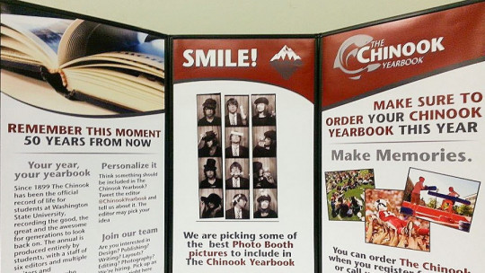
The brochure is a type of printed document that is divided into three parts (hence its name) and that contains basic information to promote brands, products or services.
Unlike the rest of the graphic resources used in marketing and advertising, the brochure contains a relatively large amount of ideas, data and content in general, and does not appeal so much to emotions, but rather responds to the need to synthesize information. In this way, all the available space on both sides of the brochure is used to show data that the person can consult over and over again, as if it were a small manual.
In this article We will see what are the characteristics that define the triptych , what its parts and functions are, and how it is made. But first, let’s start with the most basic.
What is a triptych?
As we have seen, a triptych is fundamentally a promotional brochure or one with a strong corporate component (except in cases where it is used as a support for a work of art, as we will see), folded in 3 parts (by having a pair of pleats, that is, a pair of points in which the paper is folded) and printed on both sides.
Normally, pleats follow a vertical axis, perpendicular to the direction of the text lines Thus, each of the parts of the triptych that remains between the pleats forms columns of paragraphs separate from those on the other side of the fold.
Since brochures actually have 6 sides when folded into 3 parts, they can contain a lot of information which goes beyond the logic of drawing the attention of potential clients (which is the fundamental objective of many conventional advertising pieces) and contributes to the potential client being the one who actively gets involved in reading the text and examining the images that accompany the written part.
Types of triptych
This is a summary of the types of triptych that exist.
1. Advertising brochure
This type of triptych aims convince the reader to buy or continue buying a product or service
They are normally obtained in reception rooms of entities that have some relationship or affinity with the entity that commissions the production of the triptych, since it is understood that those who frequent these spaces are especially likely to be interested in what the brochure talks about. This will be the triptych format that we will focus on most.
2. Propaganda triptych
This is less common than advertising, but its objective is similar: it also tries to convince. However, what you want to convince yourself of is not the purchase of a product or service, but the adoption of a certain more or less general ideological system
For example, such a pamphlet may attempt to convince people of the need to pressure the government for more funding for public healthcare, or it may make arguments in favor of anarchism in general.
3. Information brochure
In this case the persuasive component of the triptych loses importance, and the need to inform readers of something gains However, normally this document also attempts to persuade, even if it is by offering an embellished image of the entity that commissions its production or of which the text speaks.
These types of services are usually within the facilities of an area that can be visited: museums, art galleries, ruins preserved and exposed to the public, etc.
4. Artistic triptych
This type of triptych can take any form, because as such It is only the material support on which a work of art is made
Included here are both triptychs made on rigid materials associated with the religious iconography of certain confessions (such as the Orthodox Church of Eastern Europe) and some fanzines made in a more or less amateur way in Western societies, divided into vignettes that They tell a story.
Parts that make it up
One way to easily understand what the basic characteristics of the triptych are is to know the parts that constitute it. These are not very different from those that make up the basic structure of most fiction and non-fiction texts, but in this case they take on certain nuances, given that They are applied to material that normally belongs to the world of marketing which, although it contains a lot of text, still relies heavily on the image to please and attract attention.
Thus, the parts of the triptych are as follows.
1. Cover
The cover is the main visual element used in the design of the triptych to attract attention Marketing and design specialists know that much of the persuasive power of this brochure will depend solely and exclusively on the quality of this first component of the brochure, and that is why they take great care of its details.
The cover must be perceived as a unique piece and easy to understand in its graphic and textual parts, so that it does not take much effort to know in a matter of a few seconds what type of content is in the brochure. Whether more or less people start reading will depend on the success you have in this.
2. Introduction
The introduction is located on the back of the cover, and like this, it also aims to awaken the interest of readers; However, here the tool is the text, and not so much the image (although it can also be present).
A writing style that is attractive, and not just correct or informative, is usually used In this way, it helps potential clients or consumers enter into the mentality of those who are going to spend at least a little time reading what the brochure contains, going one step beyond what was achieved on the cover.
3. Development
The development includes all the synthesized information that did not already appear in the introduction. In this case, this information can be divided into sections, since although the introduction tried not to interrupt the flow of the reading too much to “hook” the readers, here it makes more sense to classify the parts of the text according to their subject areas since there are more ideas to convey.
4. Contact details
Normally, in the final part of the brochure (located in the part of the brochure that is furthest from the cover) Contact information is added and, many times, a “call to action” encouraging readers to contact the promoted entity or to purchase its services and/or products.
In the case of triptychs of a more propagandistic than advertising nature, A small text is also usually added as a conclusion recapitulating the content seen up to that point and offering a more simplified vision of the ideological position to take on a certain issue of public interest.

